In the Workspace, we have a Display Menu which alternates between Table view or Chart view.
In this article, we will show you how to chart a graph based on the table displayed.
DISPLAY > CHART BY ROW
- Under the Display Menu, Chart by Row allows the data table to be automatically displayed in a chart form by taking the row data to plot the chart.
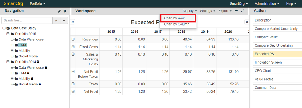
Figure-1: Selecting Chart By Row in Display Menu
- The default graph will plot the last row of data, in this case, Net Profit. Clicking on the right arrow attached to the Action panel will allow you to extend the Workspace area to the right.
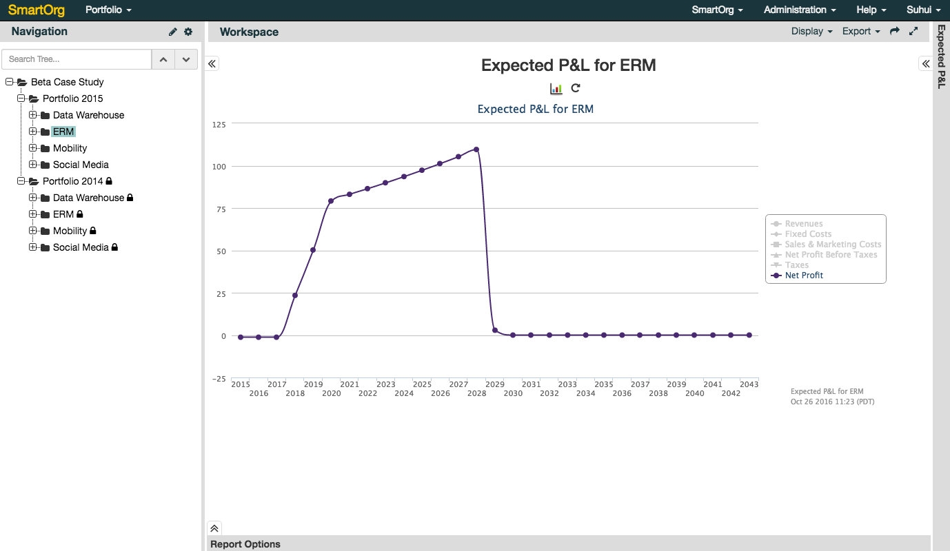
Figure-2: Graph for Chart By Row in Workspace
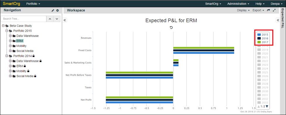
- You can click on the right-side legends to plot additional rows of data. On the top of the chart, there is also an option to display the chart in the form of a bar graph.
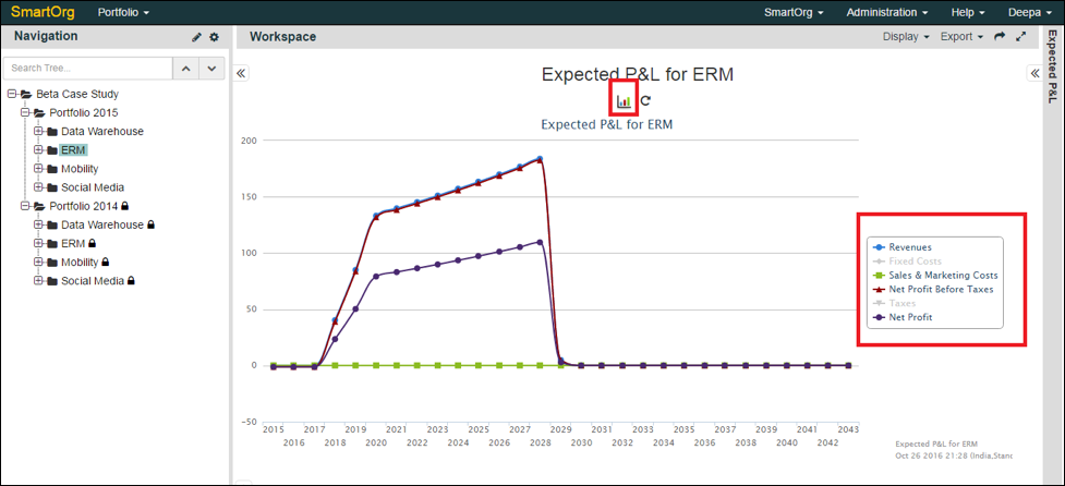
Figure-3: Additional Rows plotted in the Chart by selecting the desired legends on the right
DISPLAY > CHART BY COLUMN
- Under the Display Menu, Chart by Column allows the table to be automatically displayed in a chart form by using the column data.
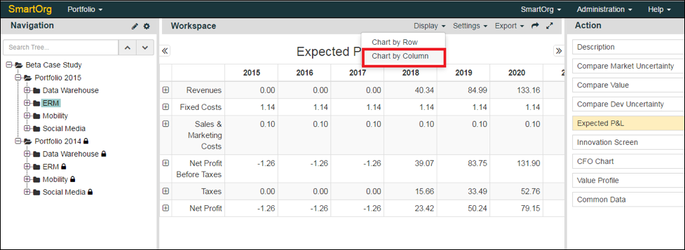
Figure-4: Selecting Chart by Column in Display Menu
- When the chart is displayed, the window can be expanded to the right-side using the right arrow (>>) where you can choose to click on multiple years to see different column-wise data plotted with specific color legends.
0 Comments