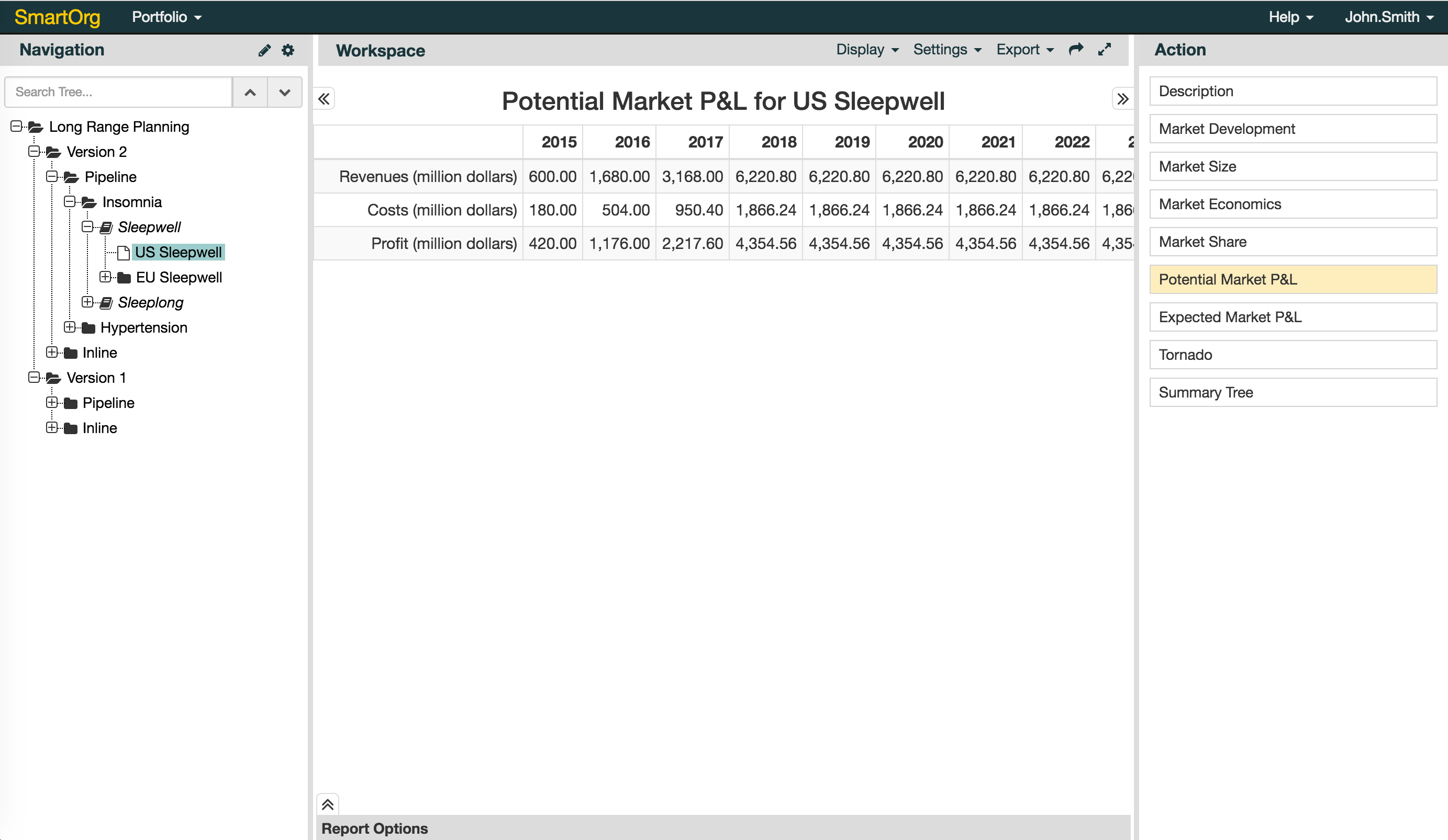
In Rangal version 6, there are two major categories of changes:
- Improved User Interface/User Experience (UI/UX) and;
- New features.
In this article, we provide you with an overview of these changes. You may also want to download our detailed guide attached at the end of this article, for more details.
1. Improved UI/UX
- Description page shows by default: The first time you click on a project, a description page will show up as your default page, allowing you to begin with an overview of what that project is all about.
- New design of Report Options panel: Filters, Group By, Color By, and Compare To are included under the 'Report Options' panel.
- New design of Workspace: The buttons at the bottom of a report are now in the Menu next to 'Workspace'.
- New design of Navigation panel (for Admin Only): Click on the pencil (
 ) icon and gear (
 ) icon to access the original right-click Menu.
2. New Features
- Better Support: 'Help' is included on the Top Menu for easy access to SmartOrg Knowledge Base. You can also submit a ticket to SmartOrg directly from there.
- High Security (for Administrators): Administrators can now enforce password change for the new users they create in their system, ensuring greater security for everyone.
- More Sharing: A report can be shared with anyone who has an account by simply clicking on the share link (
 ) icon on the Workspace Menu.
 - More Flexibility (for Administrators): Administrators can now Arrange Nodes in their portfolio tree using the Edit Menu in the Navigation panel.
- More Insights: 'Color By' under 'Report Options' panel can help you distinguish different kinds of projects by colors, allowing for more clear insights in your reports.
You can experience the new system using the original url your company has e.g. https://yourcompany.smartorg.com and the same login information.

For more details, please download the Powerpoint documentation on Rangal 6 attached below.
0 Comments